Me-Mind data visualization workshop by Domestic Data Streamers
“The world cannot be understood without numbers, but it will not be understood with numbers alone”.This is a premise that we proudly follow at Domestic Data Streamers and that is very helpful in explaining the work we do. While we recognize how useful data can be to explain realities in depth, to drive change you need people to care about these numbers. And storytelling is an ancient and powerful tool in understanding the world in a deeper and more human way. That is why our installations and exhibitions combine both.
The question of how to turn data into stories guided the 3 hour workshop we gave at the Internet Festival (which hosted also the installation “Il Nodo della Cultura”) last October for roughly 15 attendees. Although they all had different backgrounds (museums, digital humanities, design and biology), they shared a central challenge in their day to day jobs: to communicate technical or niche information that is data-heavy to reach the general public.
In this article we want to share with you the three exercises we did with the goal of starting conversations using questions, data and objects.
Exercise 1 – Human data visualization
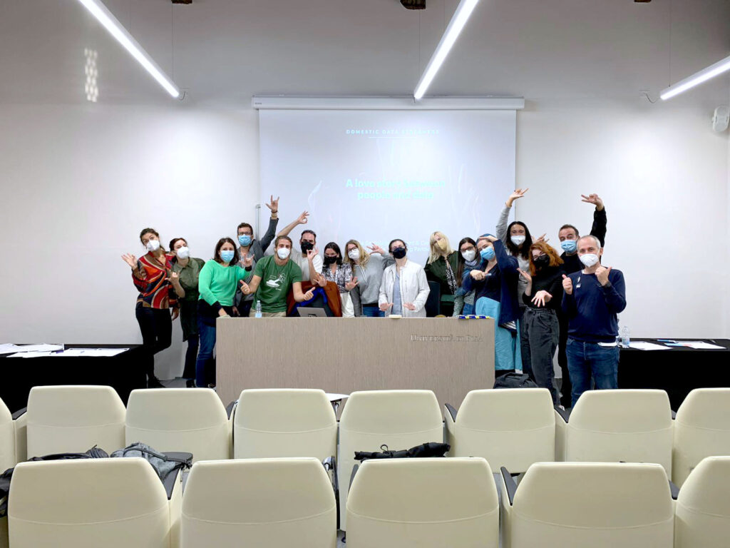
How to break the ice among strangers while respecting social distancing? We asked people to answer dichotomous questions about themselves positioning their bodies in space as if they were data points. Each end of the room would represent one answer, and for every new question, our attendees had to choose their standpoint moving around the room. Without talking, we got to visualize, for instance, how sure people were about working in the cultural or creative sectors for the rest of their lives, if they were more into Raffaella Carrà or Laura Pausini, and in the case of having to choose, if they would choose their mother or father.Exercise 2 – Pocket data
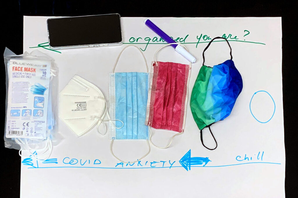
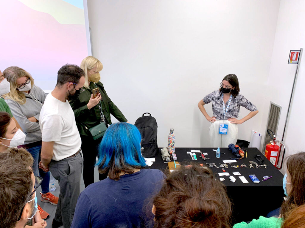
After splitting the group in half, attendees put down on the tables all items they had in their pockets or hand-bags. Keys, agendas, pens, masks, umbrellas, water bottles, combs and more covered the workshop tables. We asked people to look at these objects and try to group them to visualize specific topics.For example, different types of masks were used to visualize levels of Covid-19 anxiety. An FP-2 mask represented those who are most concerned about the virus, while a mask made out of fabric without an official label of protection represented the people who are most relaxed about it.
Exercise 3 – Data conversations
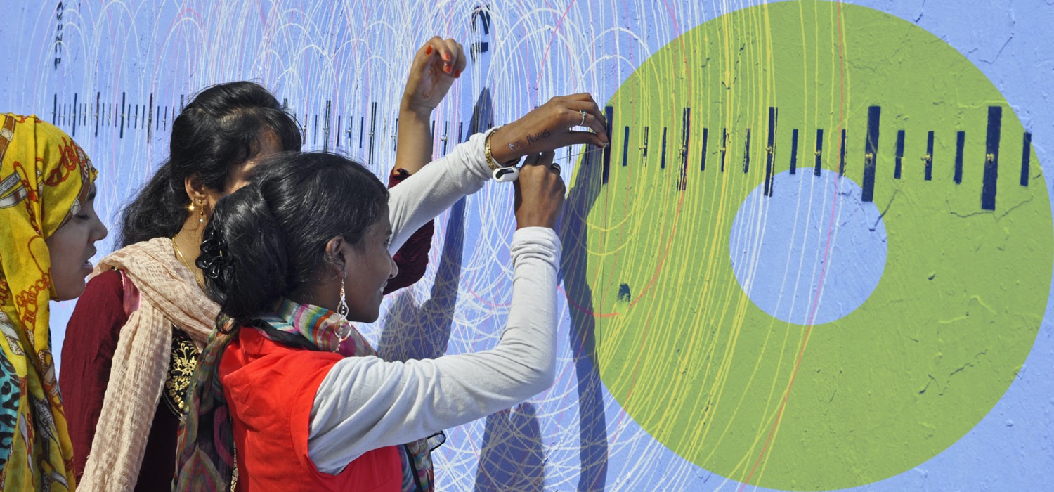
The main exercise of the workshop was about creating conversation artifacts that use simple visualization systems. Before creating their own, we wanted our attendees to grasp how apart from asking the right questions, the context and formalisation we choose (materials or objects) can help us boost engagement and reinforce the topics we’re discussing.Among a few other projects, we told them about the time we invited people to face their moral contradictions in the face of justice, visualizing their opinions over a balance installed inside prison cells, or about how we asked people to cross their actual age with their dream age using logs to discover what the ideal or “golden age” according to a majority is.
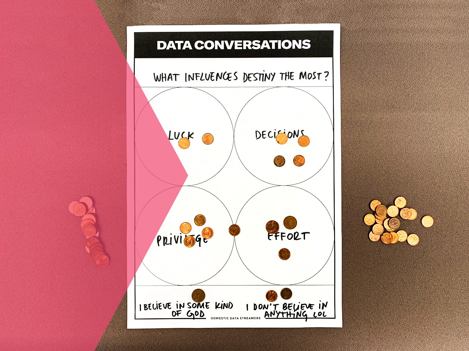
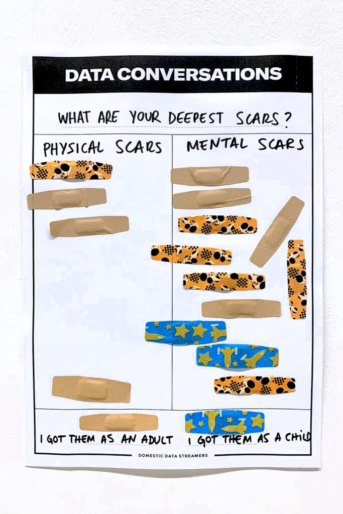
Afterwards, we tried out different data conversation templates on site that participants could choose from to pose their own questions. Although we were using the simplest system possible (a paper stuck to a wall), we saw how we could also use objects such as bandaids to speak about scars, or coins to discuss what influences destiny the most – items that helped make the questions more impactful and the interactions more fun.
Conclusions
Two interesting learnings about data came up during the final minutes of the workshop.First being that: data can be both rigorous and emotional, so why sacrifice one of these qualities?
And secondly: data is not only something that can be given to us in order to be visualized, but is something we can generate ourselves around the topic we’re interested in, using tools as simple as a piece of paper and a set of stickers.
